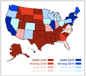
From Nate Silver's NY Times weblog FiveThirtyEight, captured Saturday, November 3, 2012:

The Los Angeles Times electoral map, again a prediction from Saturday. Note that this analysis doesn't give exact numerical predictions. The Chicago Tribune links to the same map.
The Detroit Free Press runs with a map from Real Clear Politics:
The Australian Broadcasting Company (ABC) interactive map, showing toss-up states in orange:
Thanks to Naomi Zikmund-Fisher, here are a few more:
From Electoral-Vote.com:

From election.princeton.edu, this map that shows equal area based on electoral votes:
A second distorted map, this one from Frontloading HQ:

Finally, this NPR map shows campaign spending by state, with the size of the state adjusted to match where the money is going. From the story "A campaign map morphed by money", this clearly shows which states are battleground states:
Look for more maps here on election night – if you find any more or know of any other that are good leave a comment and I'll add them in.


Some other good sites are electionprojection.com, election.princeton.edu and electoral-vote.com
Thanks Naomi! Added them in.